

I’m so old, I still printed out posters in the UK and took them as my carry-on luggage to conferences in Canada (where the roll eventually arrived at Vancouver airport together with loads of skis). I never even knew that more tools apart from PowerPoint existed to communicate data, and my presentations often looked like this.
There’s nothing wrong with presenting research like this to a learned audience… except when they are tired from a full week of conferences and networking. Or maybe if a reviewer is going through the 2nd or 3rd iteration of a revised manuscript… Making your data visually appealing is easier when good images are the cornerstone: but what happens if they’re not?
Data analytics refers to any form of analysis of data—whether in a spreadsheet, database, or app—where the intent is to measure an output or performance. However, lately, I have been playing with the concept that data without proper visualization are merely unprocessed information.
Indeed, data visualizations have been used throughout history to track patterns and inform decision making. They leverage the way the visual system of human beings is connected to uncover trends, spot outliers, encompass large amounts of data, or synthesize information. This means that every data visualization needs a defined goal.
What’s the story?
Whether talking to experts or to the general public, having access to proprietary tools or only what is available for free, the first thing to know when planning a presentation is to understand your audience. Do you have a call to action? How will you measure success?
Data come in many formats. Tableau Public is a free visual analytics platform that provides the necessary tools to make data actionable. You can explore, create, and publicly share data visualizations (or vizzes) online using public data. This is a great tool, but information overload is often a problem. Therefore, how do we keep the message simple and on track? By choosing charts that everyone understands.
Good titles capture the takeaway of the visualization, telling the reader what conclusions can be drawn from the data. These are “active titles” or “headlines.” Generally, concise, active phrases make it easier for readers to understand what the viz is aiming towards.
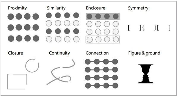
It is also necessary to improve our knowledge of how the brain perceives visual stimuli. Gestalt principles describe how our mind organizes individual visual elements into groups to make sense of the entire visual. When designing a visual tool, these principles can highlight essential patterns and downplay other patterns.
The type of data you are working with and the number of variables that need to be visualized at once will define your chart choice. Although the allocation of each chart into specific functions is not a perfect system, it still works as a useful guide for selecting a chart based on analysis or communication needs. A list of charts categorized by their data visualization functions or by what you want a chart to communicate to an audience can be found at The Data Visualization Catalogue.
Most importantly, deception (whether intended or unintentional) must be avoided. Therefore, dual axis charts, pie charts, and rounded edges in bar charts should be absent from effective data viz.
If the variables to be compared are ordinal or sequential, vertical bar charts are used. However, if the variables are categorical or nominal, the data labels are often too important to be left out, and reading them horizontally is easier—hence, and horizontal bar chart should be used.
Lines are usually used to show how some quantity has changed (or remained the same) over time. For instance, a line chart can convey that a measurement improved dramatically, while a multiline chart can convey a trend of two variables to diverge moderately.
Data labels should be used sparingly and only when needed to call attention to a specific detail. Overlaying visual annotations onto a chart can be used effectively to explain data within a context. To make a piece of data stand out, the secondary chart elements have a neutral or grey colour, and a contrasting colour is chosen so that the main point stands out.
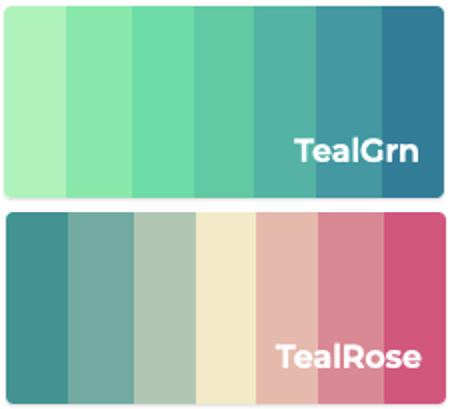 When used to represent a number, you need to create a colour scale. Then, color can be utilized to group related data points. Colours are assigned to data values in a continuum, usually based on lightness, hue, or both. If the variable assigned to be coloured has inherently ordered values, then it can be depicted with a sequential palette. Low values are usually represented by light colours, and high values by dark colours.
In a diverging scheme, the colours progress outwards, growing darker from a central midpoint. A diverging colour palette will share sequential schemes on two different colours and diverge from a shared, lighter colour. If our numeric variable has a meaningful central value, like zero, then we can apply a diverging palette.
Colour is a powerful way to capture attention in visualizations. When we’re mapping data without numerical meaning (categorical variables and text), we want readers to be able to tell objects apart, so unnecessary usage of colour should be avoided. When choosing a colour palette, consider their meaning in the culture of your target audience. Mostly, be consistent with colour across charts with the same variables.
Moreover, not all data is quantitative. Taguette is a user-friendly, but somewhat limited tool that allows for coding of qualitative data, which often presents itself in the form of word documents or pdfs. Qualcoder is more robust, as it allows to code text, images, audio, and video files. It can also generate reports for text coding and for coder comparison. Below is an example from the Gale Digital Scholar Lab, a proprietary software used for text mining and especially appealing for those with no knowledge of coding.
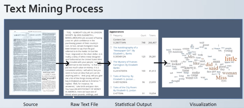
Above all else, you should let the data tell the story. A visualization method that displays how frequently words appear in a given body of text, by making the size of each word proportional to its frequency, is a word cloud. Word clouds can also be used to display words that have meta-data assigned to them. For example, in a word cloud of all the world’s countries, the population could be assigned to each country’s name to determine its size.
For the ultimate compelling presentation, the data viz gurus at storytelling with data have come up with a checklist that assesses whether the communication created solves the need it set out to. See below:
- I understand how to read the graph(s).
- The choice of visual(s) makes sense given the data and the message.
- An appropriate amount of context is present.
- Words are used well for titles, labels, annotations, and explanations.
- Visual clutter is minimized/absent.
- It is clear where I should focus first.
- Colour is used effectively.
- The communication is free of misspellings, grammar mistakes, and math errors.
- The overall design is structured: the elements are aligned, and white space is used well.
- The order of content makes sense.
- The main message and/or call to action is clear.
- Materials are optimized for how the content will be delivered.
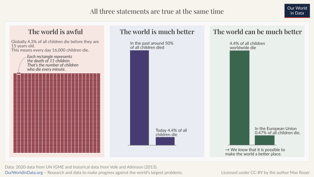
Thus, when crafting a recommendation for action after data analysis, argumentative (logical) reasoning needs to be combined with persuasive (emotional) communication. To do this, we must attach the data to something relatable and develop a sense of scale by comparing very large or very small quantities to things that are familiar and relatable to humans.
Data can be used in three ways: reactive, proactive, and predictive. We rely on data to tell us what has happened and stories to tell us what it means. Information is more memorable when enveloped in a narrative, not when served up as expository forms. Communication through stories leads to more engagement, and this is more likely to change people’s behaviour.